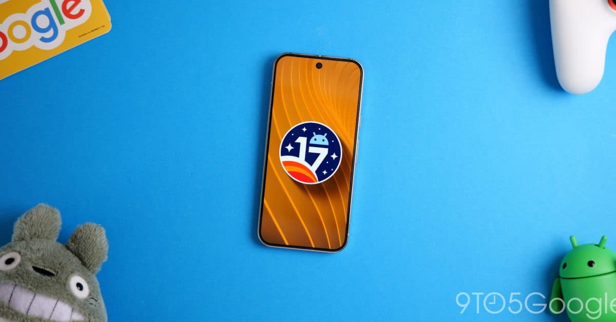
Android 17 Beta 3 is finally giving Wi-Fi and mobile data their own Quick Settings tiles. This change ends a design choice that’s been around for over a decade. The update, currently rolling out to testers, also includes deeper background blur for the system interface and new controls for dark mode on a per-app basis.
The Big Change: Two Tiles, Finally
For years, Android combined Wi-Fi and mobile data (your cellular connection) into a single Quick Settings button. This button is that panel of shortcuts you pull down from the top of your screen. You could tap it to toggle Wi-Fi or long-press to access settings. But mobile data shared the same tile, making it a hassle to switch between the two.
With Android 17 Beta 3, that’s changed. Now, Wi-Fi and mobile data each have their own dedicated tile in Quick Settings. You can toggle them independently without sifting through menus. Picture it like splitting a shared light switch into two separate ones—one for the lamp and one for the overhead light. It sounds simple, but for anyone who frequently switches connections, like travelers or remote workers, this change removes a lot of hassle.
As reported by 9to5Google, this update has been a long time coming. The combined tile design goes back to some of Android’s earliest versions.
More Blur, More Polish
Android 16 introduced translucency to the notification shade and Quick Settings panel. This effect lets you see your wallpaper faintly through the interface. Android 17 Beta 3 takes it a step further with enhanced background blur throughout the system UI.
In this context, blur is a visual effect that softens content behind a panel or menu. This way, the foreground element stands out without completely blocking what’s behind it. Apple has used this style in iOS for years. Google’s version in Android 17 appears more pronounced than what was in Android 16, according to screenshots from 9to5Google. Whether you find this look elegant or distracting likely depends on your personal taste, but it shows Google is committed to enhancing Android’s visual identity with a more layered, glass-like aesthetic.
Per-App Dark Mode Control
Android’s dark mode flips app backgrounds from white to black or dark gray to reduce eye strain, and Beta 3 offers a significant improvement. Google is adding “Expanded” dark theme controls, allowing you to choose which specific apps will use dark mode.
Previously, you could only turn dark mode on or off for the entire system. Android would decide which apps to override. Now, you can force a specific app into dark mode even if it doesn’t officially support it. You can also exclude certain apps from this override if you prefer their default light appearance. This level of control has been something power users have wanted for years, and it’s now a proper system setting instead of a hidden developer option.
For full details on per-app controls, check out 9to5Google’s coverage.
| By The Numbers: Android 17 Beta 3 | |
|---|---|
| Beta phase | Beta 3 (public testing stage) |
| Years Wi-Fi + data shared one tile | 10+ years |
| New Quick Settings tiles added | Wi-Fi and mobile data now separate |
| Dark mode control | Per-app granular override (new) |
| Visual change | Increased background blur across system UI |
| Availability | Beta testers (stable release later in 2026) |
What This Means
For most Android users, Beta 3 highlights some quality-of-life improvements rather than major new features. The separate Wi-Fi and data tiles are the most useful change. If you’ve ever struggled to quickly disable cellular data while on Wi-Fi or switched connections while traveling, you’ll really appreciate this update.
The per-app dark mode control is important for those who use various apps, where some look fine in dark mode while others appear broken or hard to read. Being able to make exceptions for specific apps gets Android closer to the fine-grained control that many users have sought through third-party apps.
The blur changes are mainly cosmetic, but they reflect Google’s broader effort to modernize Android’s visual identity consistently. If you’re using a Pixel or another device that quickly updates, this is what your phone will likely look like by late 2026.
Community Reaction
“Finally. I can’t count how many times I’ve accidentally toggled the wrong thing because Wi-Fi and data were in the same button. This should have been fixed ages ago.”
“The per-app dark mode option is huge for me. Half my apps look great in dark mode, while the other half look like someone spilled ink on them. Having real control is a game changer.”
What To Watch
- Stable Android 17 release: Beta 3 is a testing milestone, but the final public version of Android 17 is expected later in 2026. Google usually transitions from beta to stable over several months.
- Pixel rollout timing: Pixel phones typically receive Android updates first. Keep an eye on Google’s official release schedule as they incorporate Beta 3 feedback.
- Manufacturer adoption: Brands like Samsung and OnePlus will need to implement these changes in their Android versions, which usually takes additional months after Google’s stable release.
- More Beta builds: Android Authority mentions that Beta 3 is a significant step toward stability, but expect more beta releases before the final version is ready.
Daniel Park
Daniel Park covers AI, cloud infrastructure, and enterprise software for Explosion.com. A former software engineer who transitioned to technology journalism 5 years ago, Daniel brings technical depth to his reporting on artificial intelligence, startup funding rounds, and the companies building the future of computing. He breaks down complex AI developments and business strategies into clear, actionable insights for readers who want to understand how technology is reshaping industries.