A phone gives game designers very little room to get things wrong. Controls have to work under your thumb, important details need to stand out, and the whole thing has to stay clear on different screens. Good mobile design earns its keep when you barely notice any of that happening.
Mobile games have to do a surprising amount of work on a screen you can cover with one hand. Developers have less room for controls, fingers are less precise than a mouse, and the same game may need to work on several different screen sizes. That has forced some very practical design decisions, because a game can have clever mechanics and good graphics but still become annoying when the player cannot comfortably see or control what is happening at all.
Small Screens Changed the Rules
Mobile design works best when the game keeps its main action readable without making you hunt around the display. Big Bass Bonanza is built in HTML5 and runs on smartphones and tablets as well as desktop screens, with the game resizing to suit the device. Its 5-reel, 3-row layout uses 10 fixed paylines, which keeps the playing area easy to follow even when the available space gets tighter.
That same logic carries into the bonus feature. Fish symbols can display cash values, while the fisherman Wild collects those values during free spins. The screen has one clear focal point, so the extra mechanic adds interest without turning the mobile display into a puzzle the player has to decode before the next spin.
Touchscreens Forced Developers to Rethink Controls
A mouse gives you a tiny pointer; a finger covers part of the thing you are trying to press. That simple difference changes a lot. Mobile controls need enough space around them, and they have to respond cleanly when you tap rather than demanding the precision you would expect from a cursor.
Google’s Android guidance recommends touch targets of at least 48 by 48dp, which works out at roughly 9mm on screen. That gives developers a useful baseline when buttons have to sit beside the actual game. The goal is practical: keep controls large enough to hit comfortably, then leave the rest of the display free for the part the player came to see. That sounds minor, but it isn’t.
Good Mobile Design Decides What Gets the Space
Small screens punish clutter because every extra button or label competes with the main action. Watch design has the same problem on an even tighter display, where useful information has to earn its place. Samsung’s Watch Face Studio lets users decide where heart-rate data or calendar information sits on the screen.
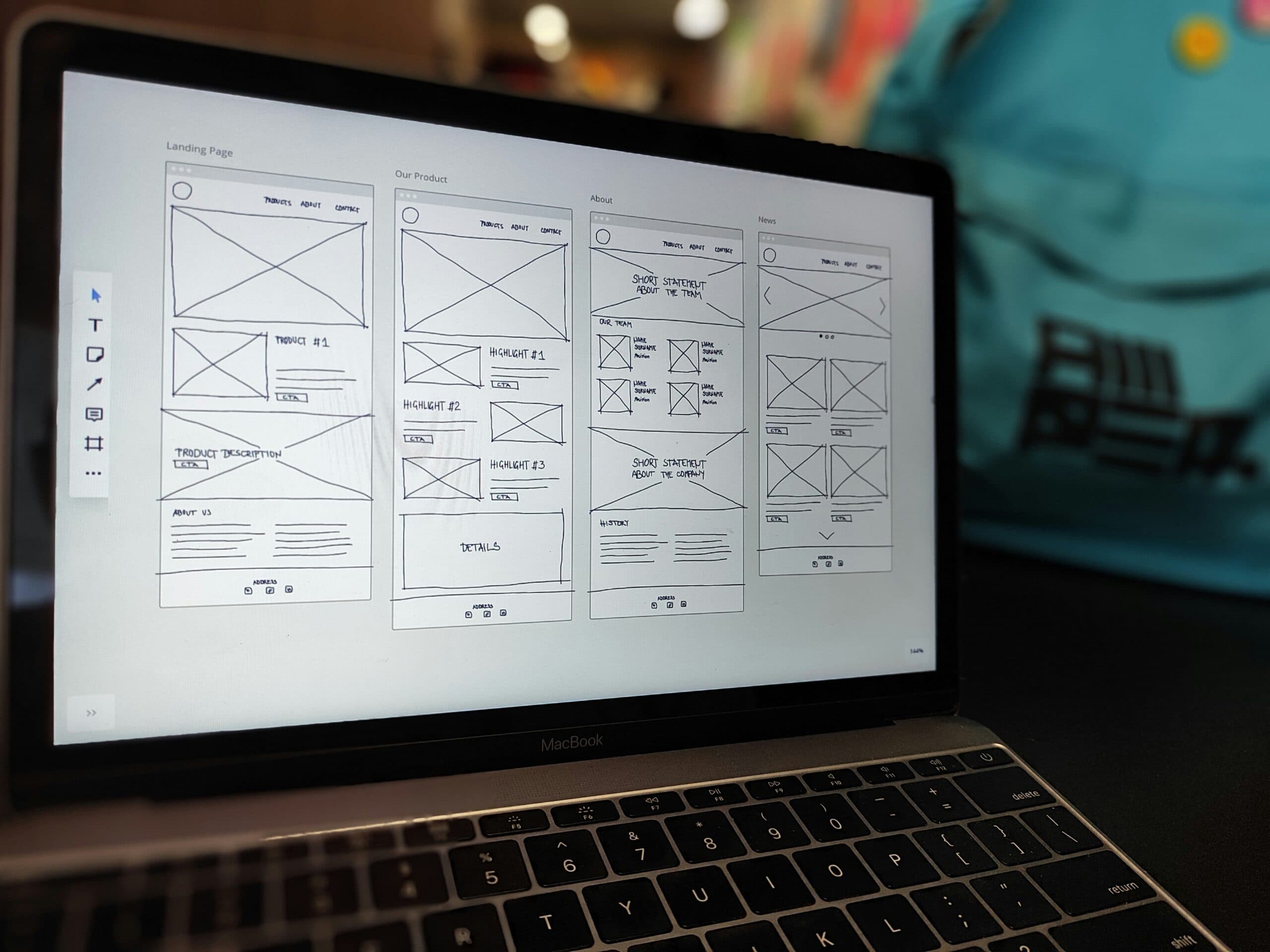
Games need the same discipline. A score can sit at the edge, while the central action stays clear. Temporary controls can appear when needed and disappear when their job is done. Good mobile design is largely about choosing what deserves space right now, then getting everything else out of the way. On a phone, wasted space becomes obvious very quickly.
Visual Hierarchy Tells Your Eye Where to Go
A busy screen becomes easier to read when important elements stand out before the decorative ones. Designers can create that order through scale or contrast, giving the player an obvious first place to look. Adobe’s design guidance describes visual hierarchy as arranging elements by importance so the eye knows where to go first.
That principle becomes useful on a phone, where there is little room for competing information. A bonus symbol should register quickly, and an active button needs to separate itself from the background. The player should not have to stop and inspect the screen to work out what changed; the design should make the important change obvious in the moment.
One Layout Has to Work Across Many Devices
Mobile no longer means one standard phone size. Developers have to deal with different aspect ratios, larger phones and tablets, then make sure the same game remains usable when the available space changes. A layout that works nicely on one device can become cramped on another unless the interface adapts.
Responsive design solves that by letting the game reorganize or resize elements as the screen changes. Important information stays visible, controls remain reachable and the main action keeps enough room to breathe. That is why cross-device testing is such a large part of mobile development: the design has to survive more than one screen without forcing the player to relearn where everything sits. That keeps play consistent across different devices.
Performance Still Has to Hold Up
A mobile game can be clear and still fall apart if it runs badly. Developers have to balance visual detail against the hardware doing the work, especially when the same title runs across devices with different capabilities. Smooth animation and responsive controls depend on sensible choices behind the scenes, because a polished screen is only useful when the game reacts properly to the player immediately.

Nick Guli
Nick Guli is the founder and editor-in-chief of Explosion.com, which he launched in February 2012. With over a decade of experience in digital publishing, Nick oversees editorial direction across entertainment, gaming, technology, and lifestyle content. He is an avid gamer and movie enthusiast who brings a critical eye to coverage of industry trends, game reviews, and entertainment news.