Google is rolling out a major redesign of its app icons on Android. This isn’t just another software update; your home screen is about to look quite different, whether you like it or not.
The new icons are part of Google’s effort to create a unified visual identity. They’re incorporating soft gradients and rounded shapes across their main apps. So, apps like Gmail, Google Maps, Google Drive, and YouTube are all getting fresh looks at around the same time.
What’s Actually Changing
This redesign ditches the flatter, geometric icon style that Google has relied on for years. The new icons feature gradients that add a more dimensional, glossy feel. You might not notice the change immediately, but once you do, it’ll stick with you.
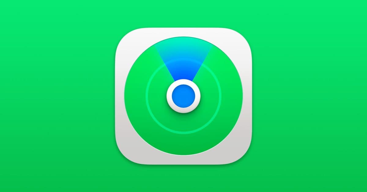
One app getting a refresh is Find Hub, Google’s location-sharing app (formerly known as Find My Device). It’s the Android counterpart to Apple’s Find My. According to 9to5Google, Find Hub is also getting a functional update. Users can now set up location-sharing notifications, so you’ll get alerts when someone starts or stops sharing their location with you. That’s a truly handy addition, not just cosmetic.
The Rollout Is Already Happening
Unlike major Android version updates that require manual downloads or carrier approvals, Google’s icon and app updates roll out quietly through the Play Store. Most Android users will wake up one day to find their home screen looking different. There’s no option to revert to the old style.
As Android Authority bluntly stated: “You can run, you can hide, but you can’t escape the gradient.”
The rollout seems to be staged, so some users see the new icons before others. If your Google apps still look the same today, don’t worry—they won’t for long.
By The Numbers
| Data Point | Detail |
|---|---|
| Company | Alphabet / Google (GOOGL) |
| Stock Price | $405.15 (+2.11%) |
| CEO | Sundar Pichai |
| Headquarters | Mountain View, CA |
| Founded | 1998 |
| Sector | Big Tech |
Why Google Does This
Big tech companies refresh their visual identities for a variety of reasons. Sometimes, it’s about modernizing their brand. Other times, it’s about making their product family look cohesive, so all Google apps feel like they belong together. Occasionally, they want to signal change, even if there’s no major product shift behind it.
Think of it like a restaurant chain repainting all its locations the same color. The food remains unchanged, but the brand feels renewed. For Google, which has tons of apps on billions of Android devices, a synchronized icon refresh is one of the most visible ways to make a statement without altering any functionality.
What This Means For Everyday Users
For most people, this is a minor inconvenience. Your apps still function the same way. However, if you’ve organized your home screen based on recognizing icons by muscle memory, this redesign can be a bit disorienting for a few days until you adjust. It’s like a grocery store rearranging its aisles.
The Find Hub notification feature is the more practical addition here. If you share your location with family or friends, getting a notification when someone stops sharing adds a layer of awareness that wasn’t there before. Parents keeping tabs on teens or friends planning meetups will likely find this useful.
If you’re using an Android device with a third-party launcher (an app that completely replaces your home screen, like Nova Launcher), the impact might differ. Some launchers let you lock in custom icon packs, which would override Google’s updates.
Community Reactions
“I genuinely thought my phone had been compromised when I saw the icons looked different this morning. Took me 20 minutes to figure out it was just a Google update.”
“The gradient is fine. What bugs me is that they didn’t ask. One day it’s different and that’s it. At least give us a toggle.”
What To Watch
- Coming weeks: The staged rollout will likely reach most Android users around the globe. If you haven’t seen the new icons yet, get ready.
- Find Hub updates: The location notification feature is rolling out now via a Play Store app update. Check the Google Find Hub listing if you want to force the update manually.
- User backlash vs. acceptance: Google has reversed visual changes before if the reaction is strong enough. Keep an eye on community forums over the next few weeks to see if this redesign is well-received or prompts pushback.
- iOS: Google’s iPhone apps may get matching icon updates to maintain a consistent visual identity across platforms.
Ava Mitchell
Ava Mitchell is a digital culture journalist at Explosion.com covering social media platforms, streaming services, and the creator economy. With 4 years reporting on TikTok, Instagram, YouTube, and the apps that shape daily life, Ava specializes in explaining platform policy changes and their impact on everyday users. She previously managed social media strategy for a tech startup, giving her firsthand experience with the platforms she now covers.