According to all marketers, a good design of your logo catches the eyes of the customers and represents the first selling point.
However, the final result it’s not always like they have imagined it.
We’ve made a compilation of 14 epic logo fails that will make you laugh all day. All of these logos have a hidden message in them, that will make you think something else than its actual purpose.
Take a look at these logos we gathered for you. Oh boy, they are hilarious.
The Logo for Catholic Church’s Archdiocesan Youth Commission
![]()
Via escorrecto.com.mx
This logo was designed especially for the Catholic Church’s Archdiocesan Youth Commission. On top of that, the logo won an award from LA’s Art Directors.
A-Style
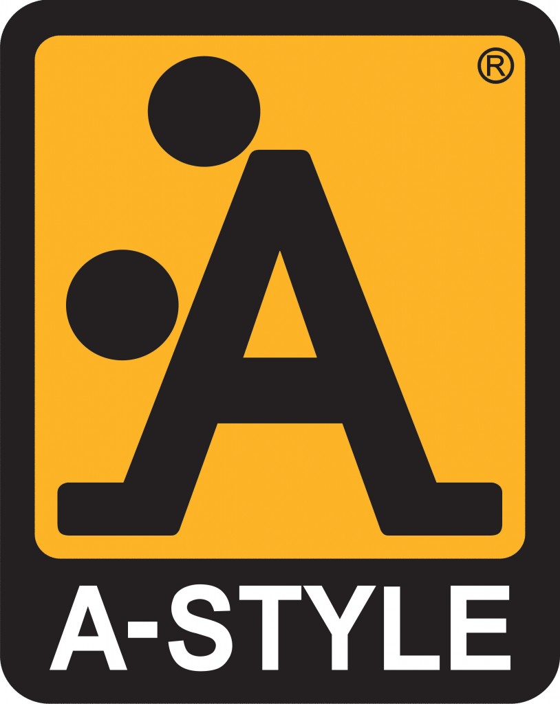
Via crasstalk.com
The logo that made all people laugh. The world still doesn’t know its real intention, but it sure looks funny.
Arlington Pediatric Center
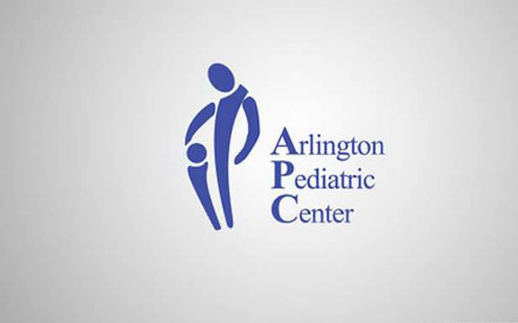
Via diazepam.fr
They even made this logo their official brand. We were seeing it on every center. People even took photos with it.
Maple Syrup
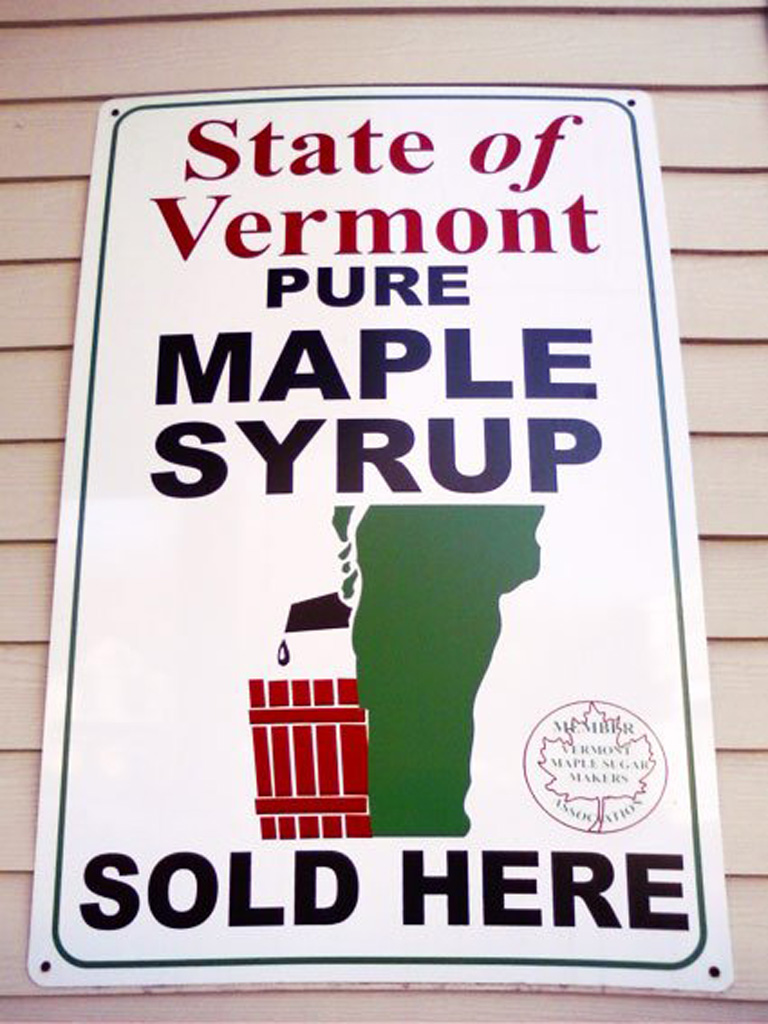
The state of Vermont got it all wrong with this ad for syrup. On first sight this logo gives you wrong direction until you see that they are offering syrup.
Sun Rise Sushi
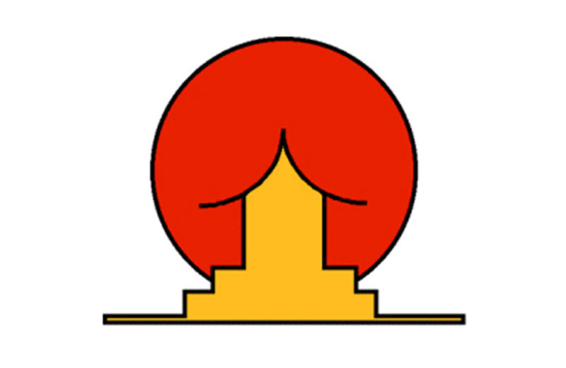
Via plus.google.com
We shouldn’t comment on this, but it was meant to be a house under big yellow sun. Can you tell?
MegaFlicks
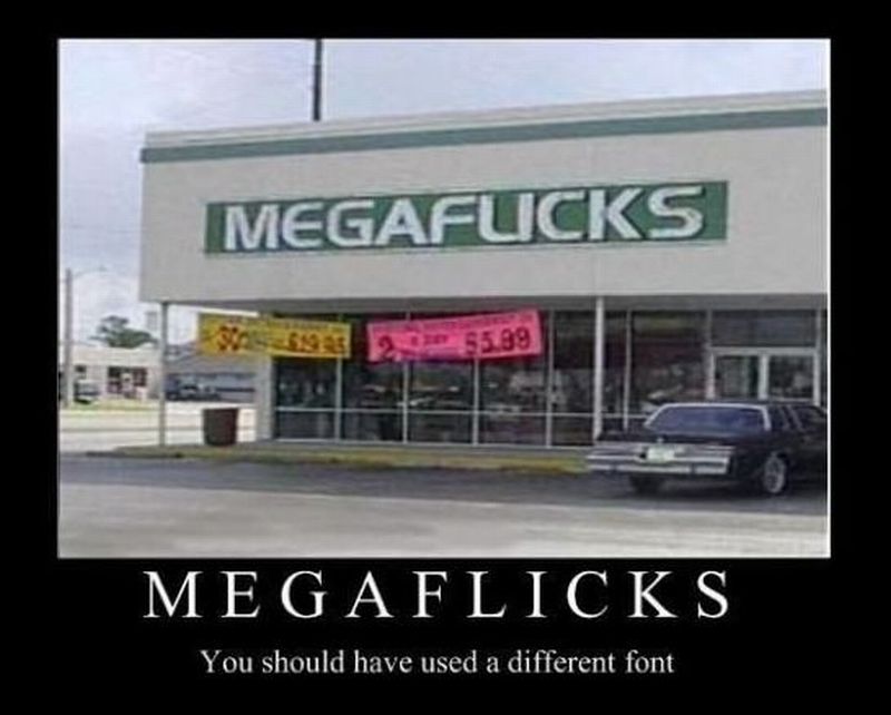
Via bartcop.com
MegaFlicks should’ve use different font than this. It sure gives you wrong perspective about what are they selling in there.
Mont Sat
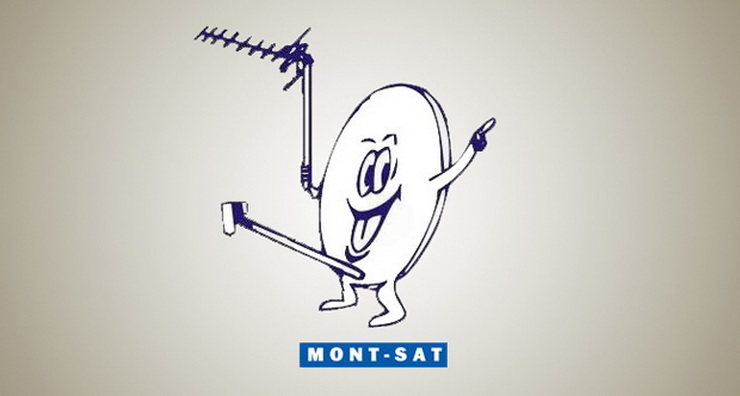
Via lovelogo.pl
Who doesn’t want to order a TV Satellite, when the logo looks so happy?
Office of Government Commerce
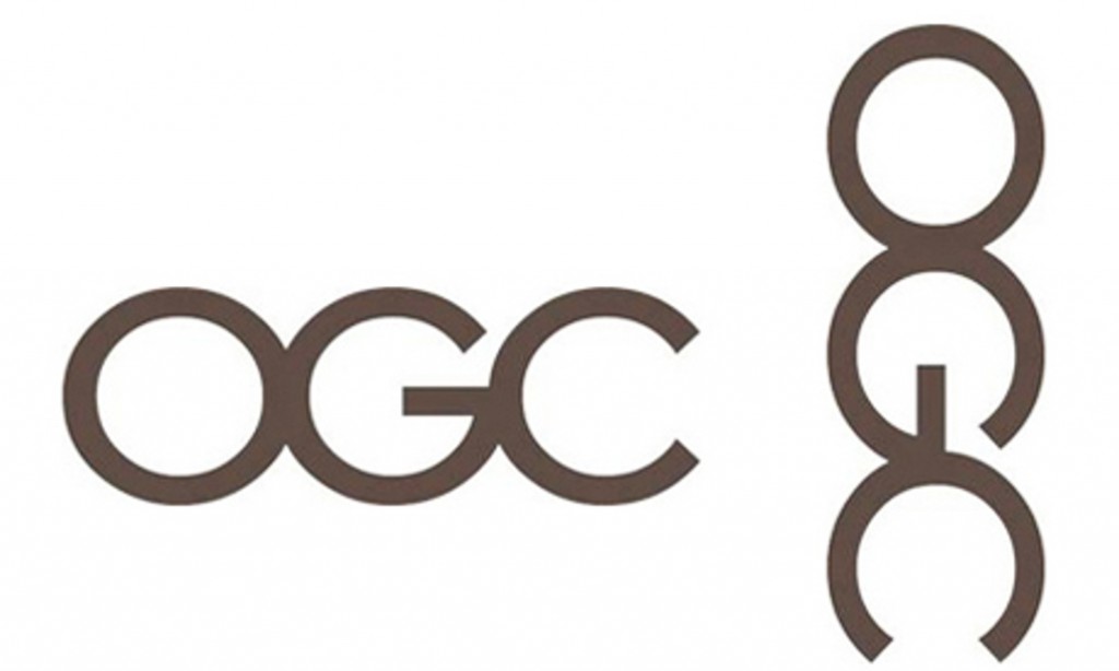
Via taringa.net
An independent Treasury office. It tells you that you need to look at the things from another perspective in order to see the right picture.
Kids Exchange
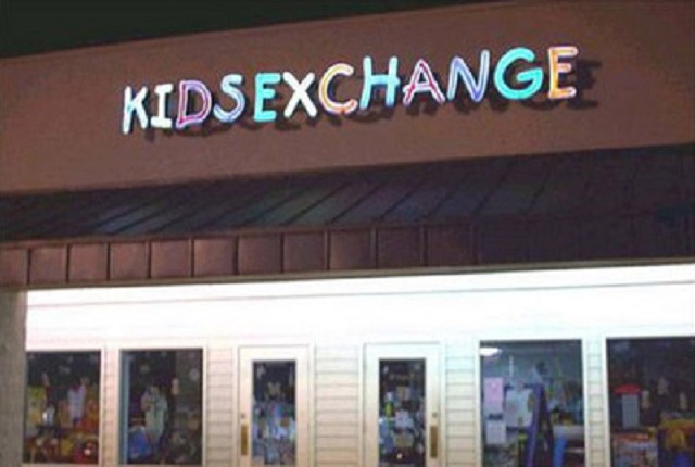
No-Space-Logo doesn’t always look good. Just ask the people from Kids Exchange and they will tell you the same.
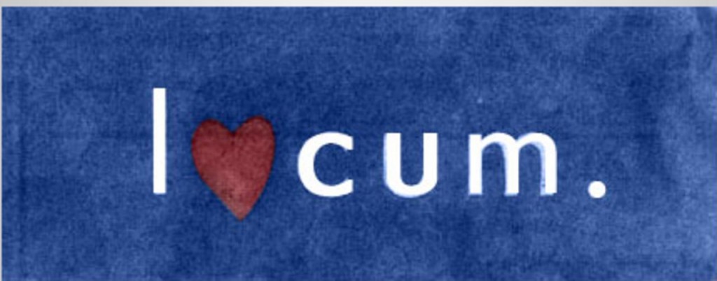
Swedish Locum
Via thetoc.gr
A Swedish company for locum, thought it would be really cool to throw a heart there to replace the “o”. This logo was released just before Christmas.
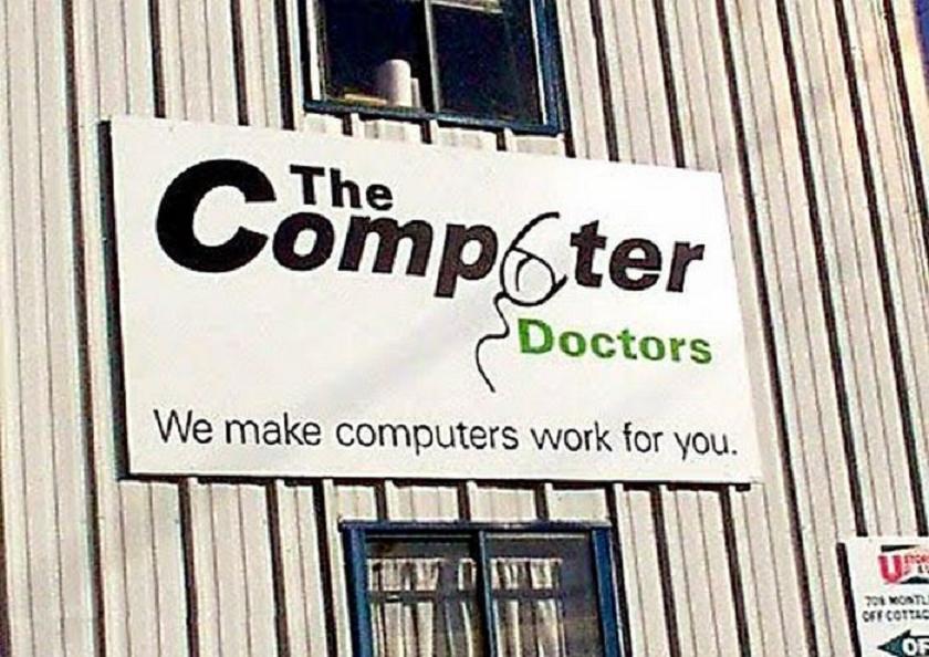
The Computer Doctors
Via 21region.org
Looking at this logo makes you wonder if their specialty is fixing computers or something else.
Kudawara Pharmacy
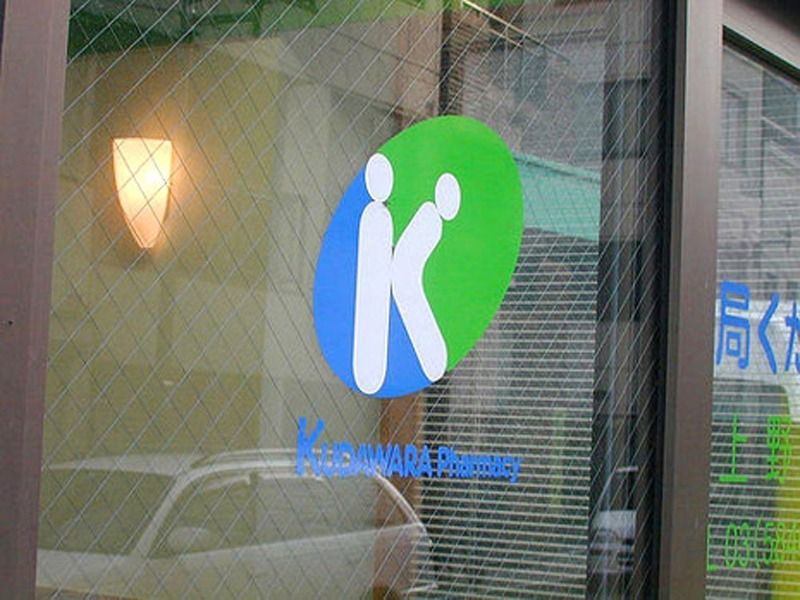
We’ve been avoiding talking about this, but this Japanese pharmacy definitely gave another meaning of the letter “K”
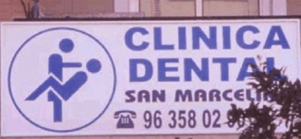
Clinica Dental
Via geniv.forumcommunity.net
Not sure if they offer dental services or… Maybe they have special methods for giving anesthesia to their patients.
Pepsi
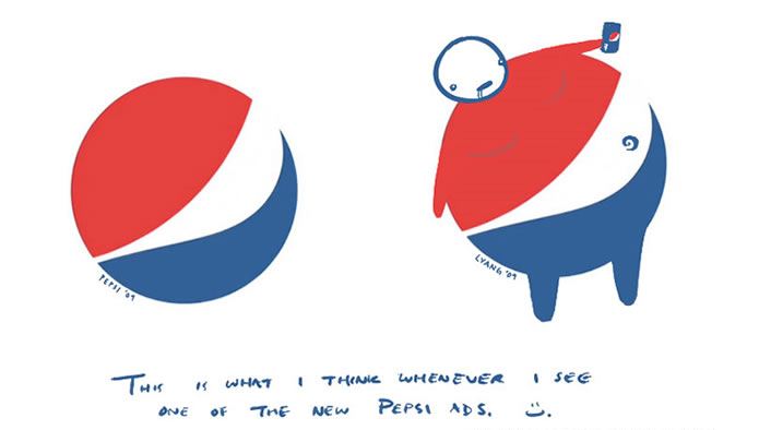
Via geekadelphia.com
We are still making fun of Pepsi with this logo. Once you see that fat guy the Pepsi logo won’t look the same, ever.
One Comment